Switch Example – Android Jetpack Compose
In this tutorial, we shall learn how to display a switch or toggle UI element using Switch composable in Android Jetpack Compose.
A Switch is used as a user interface element to allow users to toggle between two states, typically representing an ON/OFF or true/false condition.
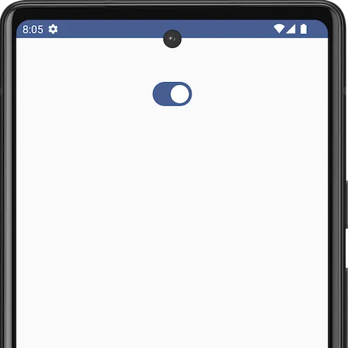
A Switch composable would be displayed in an Android application as shown in the following.
The following is a sample code for a Switch composable.
var checked by remember { mutableStateOf(true) }

Switch(
    checked = checked,
    onCheckedChange = {
        checked = it
    }
)
We shall go in deep about this code after the example.
The syntax of Switch composable with all the parameters is:
public fun Switch(
    checked: Boolean,
    onCheckedChange: ((Boolean) -> Unit)?,
    modifier: Modifier,
    thumbContent: @Composable() (() -> Unit)?,
    enabled: Boolean,
    colors: SwitchColors,
    interactionSource: MutableInteractionSource
): Unit
We will explain the parameters as the context arises.
But first, we shall create an example Android application with a Switch composable, run it, and show the screenshot of the Android emulator.
MainActivity.kt
package com.example.myapplication

import android.os.Bundle
import androidx.activity.ComponentActivity
import androidx.activity.compose.setContent
import androidx.compose.foundation.layout.Column
import androidx.compose.foundation.layout.fillMaxSize
import androidx.compose.foundation.layout.padding
import androidx.compose.material3.Switch
import androidx.compose.runtime.Composable
import androidx.compose.runtime.mutableStateOf
import androidx.compose.runtime.remember
import androidx.compose.runtime.setValue
import androidx.compose.runtime.getValue
import androidx.compose.ui.Alignment
import androidx.compose.ui.Modifier
import androidx.compose.ui.unit.dp
import com.example.myapplication.ui.theme.MyApplicationTheme

class MainActivity : ComponentActivity() {
    override fun onCreate(savedInstanceState: Bundle?) {
        super.onCreate(savedInstanceState)
        setContent {
            MyApplicationTheme {
                Column(
                    horizontalAlignment = Alignment.CenterHorizontally,
                    modifier = Modifier
                        .fillMaxSize()
                        .padding(50.dp),
                ) {
                    SwitchExample()
                }
            }
        }
    }
}

@Composable
fun SwitchExample() {
    var checked by remember { mutableStateOf(true) }

    Switch(
        checked = checked,
        onCheckedChange = {
            checked = it
        }
    )
}
Screenshot
Explanation about the Switch we used in the Example
Let us analyze the sample code we have given to display the Switch in Android application.
var checked by remember { mutableStateOf(true) }

Switch(
    checked = checked,
    onCheckedChange = {
        checked = it
    }
)
In this code,
var checked by remember { mutableStateOf(true) }- This line of code declares a variable
checkedusing thevarkeyword. - The variable is assigned a value using the
bykeyword and therememberfunction. rememberis a Compose function used for preserving state across recompositions. In this case, it is paired withmutableStateOf(true), which creates a mutable state holder for a Boolean (truein this case) and associates it with the variablechecked.- The
rememberblock ensures that the value ofcheckedis retained across recompositions of the composable function.
Now, coming to the Switch composable
Switch(
    checked = checked,
    onCheckedChange = {
        checked = it
    }
)
This code snippet uses the Switch composable, which is part of the Jetpack Compose library and represents a switch/toggle UI element. We have given arguments for two parameters of this Switch composable:
checked: It is bound to the value of thecheckedvariable. This means that the switch’s state is determined by the value of thecheckedvariable.onCheckedChange: It is a callback function that is invoked when the state of the switch changes. The provided lambda expression{ checked = it }updates thecheckedvariable with the new state when the switch is toggled.
When and Where is Switch is Used?
The switch is a convenient and intuitive way to enable or disable a feature, setting, or functionality in an application. Here are some common scenarios where a Switch is used in Android UI:
-
Settings Screen:
- Example: Enabling or disabling notifications, dark mode, or other app-specific settings.
- Use Case: Users can easily turn on or off specific features or preferences.
-
Toggle Features:
- Example: Enabling or disabling a feature or functionality within the app.
- Use Case: Users can choose whether to use certain features like location tracking, auto-sync, etc.
-
Form Elements:
- Example: A switch as part of a form to indicate agreement to terms and conditions.
- Use Case: Users can confirm or opt-out of specific conditions with a simple toggle.
Summary
In this tutorial, we have seen what a Switch composable is, how to use a Switch in an Android application, with an example.