Switch checked – Android Jetpack Compose
Switch composable has checked parameter. This checked parameter is used to check or uncheck the toggle/switch.
For example, consider the following code snippet.
Switch(
    checked = true,
    onCheckedChange = {}
)
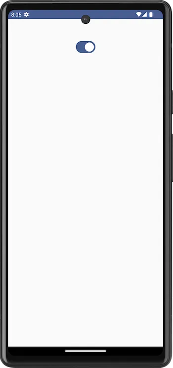
The checked parameter is set to true, and Switch would be displayed as shown in the following. Always checked. You would not be able to uncheck the switch, as it is assigned with a hardcoded value of true.

Now, consider the following code snippet.
Switch(
    checked = false,
    onCheckedChange = {}
)
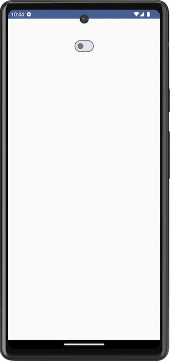
The checked parameter is set to false, and Switch would be displayed as shown in the following. Always unchecked. You would not be able to check this switch, as it is assigned with a hardcoded value of false.

When you use a Switch in an Android application, you would normally use a variable to store the checked state, instead of the hard coded true or false values, and also let the user check or uncheck the Switch.
The following is a sample code snippet, where we use a variable, say checked1 to store the checked state of the switch, and enable the switch to be checked or unchecked.
var checked1 by remember { mutableStateOf(true) }

Switch(
    checked = checked1,
    onCheckedChange = {
        checked1 = it
    }
)
We assign the checked parameter of the Switch composable with the checked1 variable, and also upon the checked state change, in the lambda function,
{
    checked1 = it
}
we assign the current state to the checked1 variable. This way, we can keep track of the current checked state of the switch, and also update the switch.
Example Android Application for Switch checked parameter
Let us create an example Android application in Android Studio with Jetpack Compose, and define a Switch composable use the code explained in our previous discussions.
MainActivity.kt
package com.example.myapplication

import android.os.Bundle
import androidx.activity.ComponentActivity
import androidx.activity.compose.setContent
import androidx.compose.foundation.layout.Column
import androidx.compose.foundation.layout.fillMaxSize
import androidx.compose.foundation.layout.padding
import androidx.compose.material3.Switch
import androidx.compose.runtime.Composable
import androidx.compose.runtime.mutableStateOf
import androidx.compose.runtime.remember
import androidx.compose.runtime.setValue
import androidx.compose.runtime.getValue
import androidx.compose.ui.Alignment
import androidx.compose.ui.Modifier
import androidx.compose.ui.unit.dp
import com.example.myapplication.ui.theme.MyApplicationTheme

class MainActivity : ComponentActivity() {
    override fun onCreate(savedInstanceState: Bundle?) {
        super.onCreate(savedInstanceState)
        setContent {
            MyApplicationTheme {
                Column(
                    horizontalAlignment = Alignment.CenterHorizontally,
                    modifier = Modifier
                        .fillMaxSize()
                        .padding(50.dp),
                ) {
                    SwitchExample()
                }
            }
        }
    }
}

@Composable
fun SwitchExample() {
    var checked1 by remember { mutableStateOf(true) }

    Switch(
        checked = checked1,
        onCheckedChange = {
            checked1 = it
        }
    )
}
Screenshot

Since, we have taken an initial value of true for the checked1 variable, the initial state of the switch is in ON state.
If you set the initial value of the checked1 variable to `false, or if the user has turned off the switch, then the switch would appear in OFF state as shown below.

Summary
In this tutorial, we have seen about the checked parameter of Switch composable, and how to use it in an Android application, with an example.