Floating Action Button Colors Example
We can set the container (background) color, and the content color of the Floating Action Button (FAB) using containerColor, and contentColor respectively.
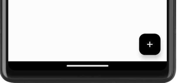
The following is a simple Floating Action Button with Black color for the container or background, and White color for the content.
FloatingActionButton(
    containerColor = Color.Black,
    contentColor = Color.White,

) {
    Icon(Icons.Filled.Add, contentDescription = "Add")
}
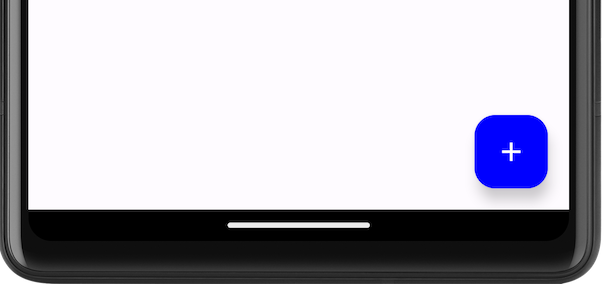
The following is a simple Floating Action Button with Blue color for the container or background, and White color for the content.
FloatingActionButton(
    containerColor = Color.Blue,
    contentColor = Color.White,

) {
    Icon(Icons.Filled.Add, contentDescription = "Add")
}
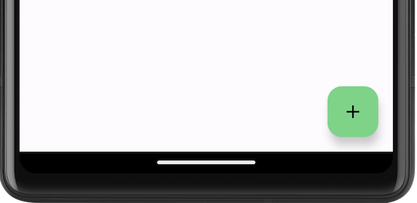
The following is a simple Floating Action Button with Blue color for the container or background, and White color for the content.
FloatingActionButton(
    containerColor = Color.hsl(128f, 0.49f, 0.66f),
    contentColor = Color.Black,
) {
    Icon(Icons.Filled.Add, contentDescription = "Add")
}
In this tutorial, we will look into an Android Jetpack Compose example, where we set colors for the content and container of the Floating Action Button.
Example Application for Floating Action Button Colors
Create an Android application with Jetpack Compose and Kotlin, and use the following MainActivity.kt code.
MainActivity.kt
package com.example.myapplication
import android.os.Bundle
import android.widget.Toast
import androidx.activity.ComponentActivity
import androidx.activity.compose.setContent
import androidx.compose.foundation.layout.Arrangement
import androidx.compose.foundation.layout.Column
import androidx.compose.foundation.layout.padding
import androidx.compose.material.icons.Icons
import androidx.compose.material.icons.filled.Add
import androidx.compose.material3.ExperimentalMaterial3Api
import androidx.compose.material3.FloatingActionButton
import androidx.compose.material3.Icon
import androidx.compose.material3.MaterialTheme
import androidx.compose.material3.Scaffold
import androidx.compose.material3.Text
import androidx.compose.material3.TopAppBar
import androidx.compose.material3.TopAppBarDefaults
import androidx.compose.runtime.Composable
import androidx.compose.ui.Modifier
import androidx.compose.ui.graphics.Color
import androidx.compose.ui.platform.LocalContext
import androidx.compose.ui.text.style.TextOverflow
import androidx.compose.ui.unit.dp
import com.example.myapplication.ui.theme.MyApplicationTheme
class MainActivity : ComponentActivity() {
override fun onCreate(savedInstanceState: Bundle?) {
super.onCreate(savedInstanceState)
setContent {
MyApplicationTheme {
ScaffoldExample()
}
}
}
}
@OptIn(ExperimentalMaterial3Api::class)
@Composable
fun ScaffoldExample() {
Scaffold(
topBar = {
TopAppBar(
colors = TopAppBarDefaults.centerAlignedTopAppBarColors(
containerColor = MaterialTheme.colorScheme.primaryContainer,
titleContentColor = MaterialTheme.colorScheme.primary,
),
title = {
Text(
"Example Application",
maxLines = 1,
overflow = TextOverflow.Ellipsis
)
},
)
},
floatingActionButton = {
val context = LocalContext.current
FloatingActionButton(
containerColor = Color.Black,
contentColor = Color.White,
onClick = {
Toast.makeText(
context,
"You clicked the FAB.",
Toast.LENGTH_LONG)
.show()
},
) {
Icon(Icons.Filled.Add, contentDescription = "Add")
}
},
) { innerPadding ->
Column(
modifier = Modifier
.padding(innerPadding),
verticalArrangement = Arrangement.spacedBy(16.dp),
) {
// body
}
}
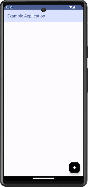
}Screenshot on Emulator
Summary
In this tutorial, we have seen how to set background and content color for FloatingActionButton composable, with examples, in Android Jetpack Compose.