Android Jetpack Compose – Filled Card
In this tutorial, we shall learn how to display a Filled Card composable in Android Jetpack Compose, where the card container is filled with a specific color.
A filled card is a card composable where the card container is filled with a color.
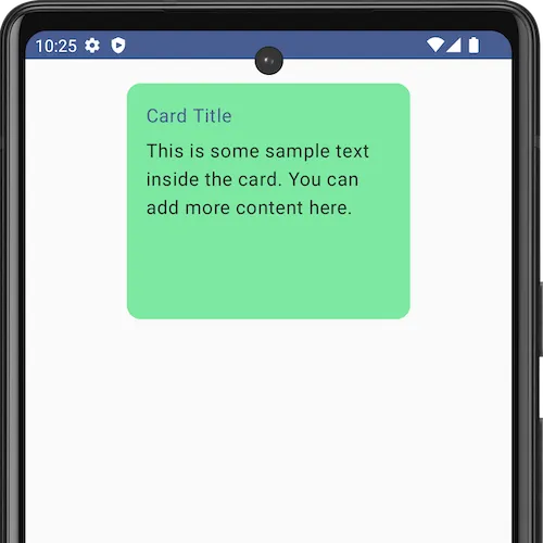
For example, in the above screenshot we have set the card container color with a specific color value using colors parameter of the Card composable, as shown in the following.
Card(
    colors = CardDefaults.cardColors(
        containerColor = Color.hsl(141f, 0.7f, 0.7f)
    ),
)
Now, we shall take an example Android application, that displays a Filled Card composable with some content, and filled with a color of Color.hsl(141f, 0.7f, 0.7f).
MainActivity.kt
package com.example.myapplication

import android.os.Bundle
import androidx.activity.ComponentActivity
import androidx.activity.compose.setContent
import androidx.compose.foundation.layout.Column
import androidx.compose.foundation.layout.Spacer
import androidx.compose.foundation.layout.fillMaxSize
import androidx.compose.foundation.layout.fillMaxWidth
import androidx.compose.foundation.layout.height
import androidx.compose.foundation.layout.padding
import androidx.compose.foundation.layout.size
import androidx.compose.material3.Card
import androidx.compose.material3.CardDefaults
import androidx.compose.material3.MaterialTheme
import androidx.compose.material3.Text
import androidx.compose.runtime.Composable
import androidx.compose.ui.Alignment
import androidx.compose.ui.Modifier
import androidx.compose.ui.graphics.Color
import androidx.compose.ui.unit.dp
import com.example.myapplication.ui.theme.MyApplicationTheme

class MainActivity : ComponentActivity() {
    override fun onCreate(savedInstanceState: Bundle?) {
        super.onCreate(savedInstanceState)
        setContent {
            MyApplicationTheme {
                Column(
                    horizontalAlignment = Alignment.CenterHorizontally,
                    modifier = Modifier
                        .fillMaxSize()
                        .padding(20.dp),
                ) {
                    FilledCardExample()
                }
            }
        }
    }
}

@Composable
fun FilledCardExample() {
    Card(
        colors = CardDefaults.cardColors(
            containerColor = Color.hsl(141f, 0.7f, 0.7f)
        ),
        modifier = Modifier
            .size(width = 240.dp, height = 200.dp)
    ) {
        Column(
            modifier = Modifier
                .padding(16.dp)
                .fillMaxWidth()
        ) {
            Text(
                text = "Card Title",
                color = MaterialTheme.colorScheme.primary
            )
            Spacer(modifier = Modifier.height(8.dp))
            Text(
                text = "This is some sample text inside the card. You can add more content here.",
                color = MaterialTheme.colorScheme.onSurface
            )
        }
    }
}
Screenshot
Summary
In this tutorial, we have seen how to display a filled card using Card composable, using an example Android Application.