Center Align TopAppBar
To center align TopAppBar, you can use CenterAlignedTopAppBar composable. The title of the application will be center aligned as shown in the screenshot.
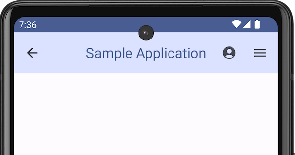
In this tutorial, we will look into an Android Jetpack Compose example, where we use a CenterAlignedTopAppBar composable in the application, with a center aligned title, colors for the app bar container and title set to specific values, and a couple of actions.
The following is the code for CenterAlignedTopAppBar composable.
CenterAlignedTopAppBar(
    colors = TopAppBarDefaults.centerAlignedTopAppBarColors(
        containerColor = MaterialTheme.colorScheme.primaryContainer,
        titleContentColor = MaterialTheme.colorScheme.primary,
    ),
    title = {
        Text(
            "Sample Application",
            maxLines = 1,
            overflow = TextOverflow.Ellipsis
        )
    },
    navigationIcon = {
        IconButton(onClick = { /* do something */ }) {
            Icon(
                imageVector = Icons.Filled.ArrowBack,
                contentDescription = "Localized description"
            )
        }
    },
    actions = {
        IconButton(onClick = {
            /* doSomething */
        }) {
            Icon(Icons.Filled.AccountCircle, contentDescription = "Favorite")
        }
        IconButton(onClick = {
            /* doSomething */
        }) {
            Icon(Icons.Filled.Menu, contentDescription = "Favorite")
        }
    }
)
Example Application for CenterAlignedTopAppBar
Create an Android application with Jetpack Compose and Kotlin, and use the following MainActivity.kt code.
MainActivity.kt
package com.example.myapplication
import android.os.Bundle
import androidx.activity.ComponentActivity
import androidx.activity.compose.setContent
import androidx.compose.foundation.layout.Arrangement
import androidx.compose.foundation.layout.Column
import androidx.compose.foundation.layout.padding
import androidx.compose.material.icons.Icons
import androidx.compose.material.icons.filled.AccountCircle
import androidx.compose.material.icons.filled.ArrowBack
import androidx.compose.material.icons.filled.Menu
import androidx.compose.material3.CenterAlignedTopAppBar
import androidx.compose.material3.ExperimentalMaterial3Api
import androidx.compose.material3.Icon
import androidx.compose.material3.IconButton
import androidx.compose.material3.MaterialTheme
import androidx.compose.material3.Scaffold
import androidx.compose.material3.Text
import androidx.compose.material3.TopAppBarDefaults
import androidx.compose.runtime.Composable
import androidx.compose.ui.Modifier
import androidx.compose.ui.text.style.TextOverflow
import androidx.compose.ui.unit.dp
import com.example.myapplication.ui.theme.MyApplicationTheme
class MainActivity : ComponentActivity() {
override fun onCreate(savedInstanceState: Bundle?) {
super.onCreate(savedInstanceState)
setContent {
MyApplicationTheme {
ScaffoldExample()
}
}
}
}
@OptIn(ExperimentalMaterial3Api::class)
@Composable
fun ScaffoldExample() {
Scaffold(
topBar = {
CenterAlignedTopAppBar(
colors = TopAppBarDefaults.centerAlignedTopAppBarColors(
containerColor = MaterialTheme.colorScheme.primaryContainer,
titleContentColor = MaterialTheme.colorScheme.primary,
),
title = {
Text(
"Sample Application",
maxLines = 1,
overflow = TextOverflow.Ellipsis
)
},
navigationIcon = {
IconButton(onClick = { /* do something */ }) {
Icon(
imageVector = Icons.Filled.ArrowBack,
contentDescription = "Localized description"
)
}
},
actions = {
IconButton(onClick = {
/* doSomething */
}) {
Icon(Icons.Filled.AccountCircle, contentDescription = "Favorite")
}
IconButton(onClick = {
/* doSomething */
}) {
Icon(Icons.Filled.Menu, contentDescription = "Favorite")
}
}
)
},
) { innerPadding ->
Column(
modifier = Modifier
.padding(innerPadding),
verticalArrangement = Arrangement.spacedBy(16.dp),
) {
// body
}
}
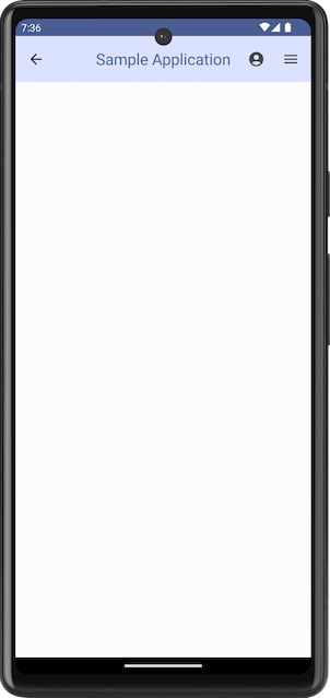
}Screenshot on Emulator
Summary
In this tutorial, we have seen how to display center aligned Top Application Bar composable with a title and some actions, in Android Jetpack Compose, using CenterAlignedTopAppBar composable.