Set Width and Height of Card composable in Android Jetpack Compose
In this tutorial, we shall learn how to set a specific width and height for a Card composable in Android Jetpack Compose, using modifier property.
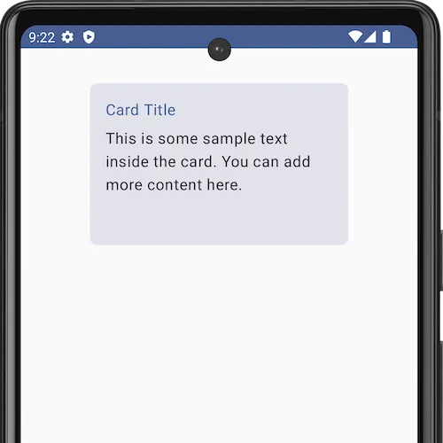
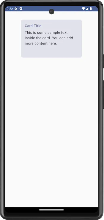
The following is an example for a Card with a height of 150.dp and a width of 200.dp.
The sample code snippet to set width and height for a Card composable is given below.
Card(
    modifier = Modifier
        .size(width = 300.dp, height = 200.dp)
)
Now, we shall take an example Android application, that displays a Card composable with a specific width of 300.dp and a height of 200.dp. You can change these dimensions to suit your requirements.
MainActivity.kt
package com.example.myapplication

import android.os.Bundle
import androidx.activity.ComponentActivity
import androidx.activity.compose.setContent
import androidx.compose.foundation.layout.Column
import androidx.compose.foundation.layout.Spacer
import androidx.compose.foundation.layout.fillMaxSize
import androidx.compose.foundation.layout.fillMaxWidth
import androidx.compose.foundation.layout.height
import androidx.compose.foundation.layout.padding
import androidx.compose.foundation.layout.size
import androidx.compose.foundation.shape.RoundedCornerShape
import androidx.compose.material3.Card
import androidx.compose.material3.MaterialTheme
import androidx.compose.material3.Text
import androidx.compose.runtime.Composable
import androidx.compose.ui.Alignment
import androidx.compose.ui.Modifier
import androidx.compose.ui.unit.dp
import com.example.myapplication.ui.theme.MyApplicationTheme

class MainActivity : ComponentActivity() {
    override fun onCreate(savedInstanceState: Bundle?) {
        super.onCreate(savedInstanceState)
        setContent {
            MyApplicationTheme {
                Column(
                    horizontalAlignment = Alignment.CenterHorizontally,
                    modifier = Modifier
                        .fillMaxSize()
                        .padding(20.dp),
                ) {
                    CardExample()
                }
            }
        }
    }
}

@Composable
fun CardExample() {
    Card(
        modifier = Modifier
            .size(width = 300.dp, height = 200.dp)
            .padding(16.dp),
    ) {
        Column(
            modifier = Modifier
                .padding(16.dp)
                .fillMaxWidth()
        ) {
            Text(
                text = "Card Title",
                color = MaterialTheme.colorScheme.primary
            )
            Spacer(modifier = Modifier.height(8.dp))
            Text(
                text = "This is some sample text inside the card. You can add more content here.",
                color = MaterialTheme.colorScheme.onSurface
            )
        }
    }
}
Screenshot
Summary
In this tutorial, we have seen how to set a specific width and height for a card using modifier property, with the help of an example Android Application.