Android Jetpack Compose – Card Example
In this tutorial, we shall learn how to display a simple Card composable in Android Jetpack Compose with a simple title and some content.
The syntax of a Card composable is as shown in the following.
public fun Card(
    modifier: Modifier,
    shape: Shape,
    colors: CardColors,
    elevation: CardElevation,
    border: BorderStroke?,
    content: @Composable() (ColumnScope.() -> Unit)
): Unit
Now, we shall take an example Android application, that displays a Title and some content in a Card composable.
MainActivity.kt
package com.example.myapplication
import android.os.Bundle
import androidx.activity.ComponentActivity
import androidx.activity.compose.setContent
import androidx.compose.foundation.layout.Column
import androidx.compose.foundation.layout.Spacer
import androidx.compose.foundation.layout.fillMaxSize
import androidx.compose.foundation.layout.fillMaxWidth
import androidx.compose.foundation.layout.height
import androidx.compose.foundation.layout.padding
import androidx.compose.foundation.shape.RoundedCornerShape
import androidx.compose.material3.Card
import androidx.compose.material3.MaterialTheme
import androidx.compose.material3.Text
import androidx.compose.ui.Alignment
import androidx.compose.ui.Modifier
import androidx.compose.ui.unit.dp
import com.example.myapplication.ui.theme.MyApplicationTheme
class MainActivity : ComponentActivity() {
override fun onCreate(savedInstanceState: Bundle?) {
super.onCreate(savedInstanceState)
setContent {
MyApplicationTheme {
Column(
horizontalAlignment = Alignment.CenterHorizontally,
modifier = Modifier
.fillMaxSize()
.padding(20.dp),
) {
Card(
modifier = Modifier
.padding(16.dp)
.fillMaxWidth(),
) {
Column(
modifier = Modifier
.padding(16.dp)
.fillMaxWidth()
) {
Text(
text = "Card Title",
color = MaterialTheme.colorScheme.primary
)
Spacer(modifier = Modifier.height(8.dp))
Text(
text = "This is some sample text inside the card. You can add more content here.",
color = MaterialTheme.colorScheme.onSurface
)
}
}
}
}
}
}
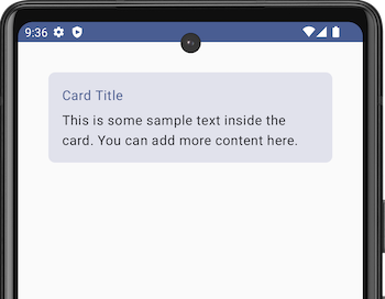
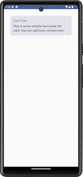
}Screenshot
Summary
In this tutorial, we have seen how to display a Card composable with a simple title and some text content, using an example Android Application.